Pop-ups. Hated by website visitors, under appreciated by website owners. There aren’t many tools that have as bad of a reputation as pop ups. Granted, this reputation has been earned. Nobody likes websites that bombard you with pop-ups every 5 seconds. Most sites don’t do this, but bad actors have ruined it for everyone.
If you are a website owner and aren’t using pop ups, you are missing out on some big opportunities. When used correctly, they are highly effective tools that will increase your bottom line.
Let’s get into it.
Why You Need to Use Pop Ups
Reduce cart abandonment
Pop-ups can give your audience a gentle reminder they still have items in their cart.
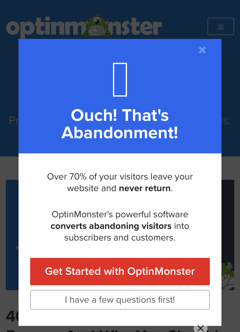
Here is a good example from Optinmonster. Optinmonster is a powerful lead generation tool. Their business is designed around turning visitors into leads, and leads into sales.
This particular popup appears when you do an action that signals you are about to leave the page.
Build e-mail list
The e-mail list is one of the most under appreciated tools in the toolbox. When you own a strong e-mail list, you have a direct line of communication with your audience. We know that up to 70% of people that visit your site never return. An e-mail list lets you capture some of that audience.
Another benefit of having an e-mail list is that you own it. You may think you own your Facebook or Instagram followers, but you don’t. Those platforms can shut down your page tomorrow and all of those contacts are gone. With an e-mail list, you are only accountable to your audience.
Improve customer experience
When you think of customer experience, that last thing that comes to mind is pop ups. That would be wrong. Pop ups can offer your audience something of value. That may be an e-book, a template or any number of other things. These “freebies” are called lead magnets and your audience will eat them up.
Types of Pop Ups
Entry
Entry popups happen as soon as a visitor enters your page. This example comes to us from Best Buy. It is not a great entry pop-up. Rather than promising deals and exclusive offers if we sign up, they could just give us a deal for signing up.
The one interesting thing about this one is the “text” option. SMS messaging is growing in popularity and it appears Best Buy has recognized that.

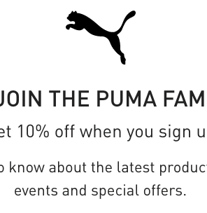
This second example is a much better one. Where Best Buy didn’t offer us anything, Puma if offering a 10% discount. If you came to spend money, a 10% discount is enticing. This popup delivers sales AND customers contact information. What more could you ask for?
Exit Intent
Exit-intent popups happen when actions are taken that suggest the visitor is about to leave the page. Some exit-intent actions could include clicking on the URL bar or moving the mouse towards the back or close buttons.
When a user moves to exit, the pop=ups are triggered to make one last attempt to get the user to take some kind of action.
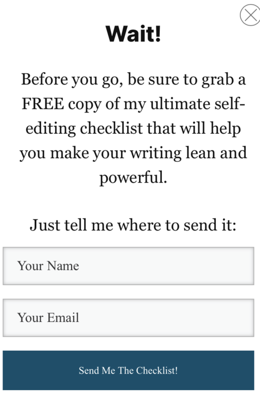
In the first example (below) we have an exit intent message that asked me to download a free editing checklist. I was on a page about editing, so a checklist for editing makes sense.
Time based
Time-based popups appear after the user has been on the page for a specified amount of time.
Scroll-based
Scroll-based popups are triggered after someone has scrolled through a certain percent of the content.
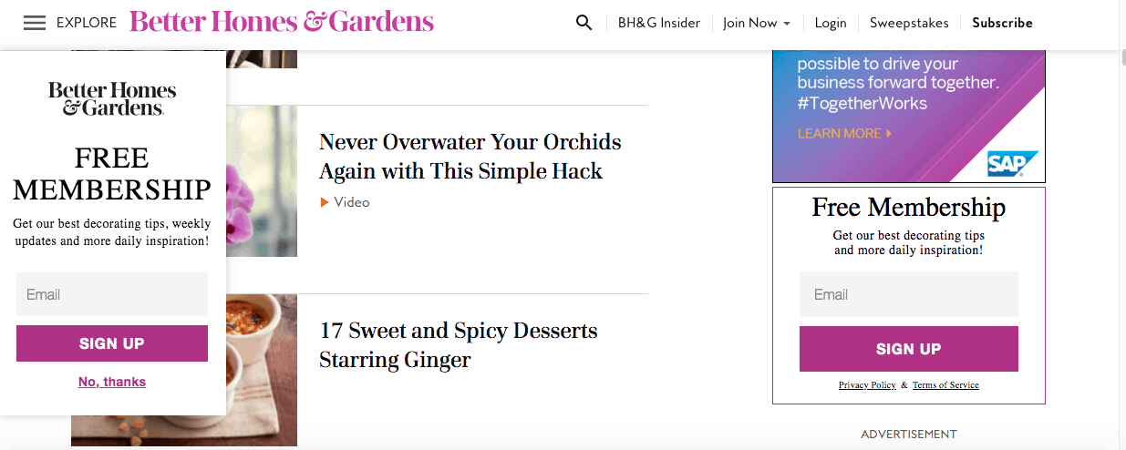
This example from Better Homes & Gardens is triggered after you get about 1/3 of the way down the page. It has a pretty basic offer that attemts to grow it ‘s e-mail list.
On-click
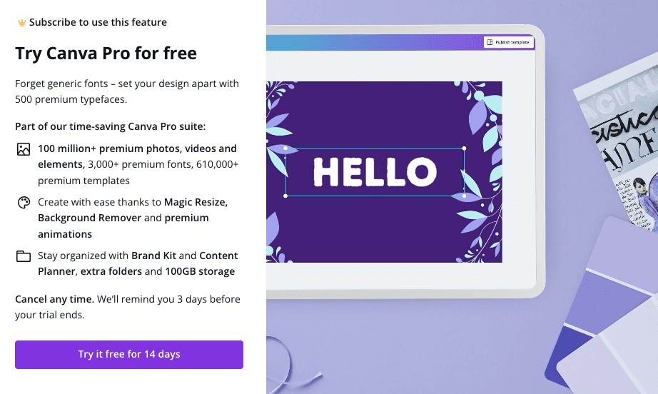
On-click popups appear after the user has clicked on a specific part of the page.
Best Pactices
Lorem ipsum dolor sit amet, consectetur adipiscing elit. Ut elit tellus, luctus nec ullamcorper mattis, pulvinar dapibus leo.
Focus on the goal
What EXACTLY, do you want your audience to do. If the end goal is to have them sign up for your monthly subscription service, your popups should be moving them in that direction. If they are learning about your service, you could offer a free trial. Or maybe a starters guide to get them going. Collect the e-mail and you’ll be able to continue moving them through the sales funnel.
Segment visitors
In today’s world, a one size fits all strategy simply doesn’t work. When you target everyone, you’re targeting no one. Luckily, popups allow you to be very specific with your message.
Update regularly
You want to revisit your popups every couple of months. If they are performing well, find out why. You can replicate that for other campaigns. If they aren’t performing, find out why. Now you know what to avoid next time.
Every marketing campaign isn’t going to be a success. But if you learn what does and does not work in every campaign, your odds of success go up dramatically.
Be strategic
Popups allow you to deliver an offer at the perfect time. Find out when your audience is the most motivated and target them then.
Avoid entry popups
Discounts for e-commerce are the one exception to the rule. You want them to know the discount is available because that will affect what they buy. Delivering the offer as they are about to make the purchase can upset your audience. Nobody wants to spend time finding a product in their budget only to find out they could have afforded a better option.
In almost every other case, entry popups are annoying. This is especially true on content pages. If someone is trying to sell me before I’ve read a single word, I’m likely to back out and go somewhere else.
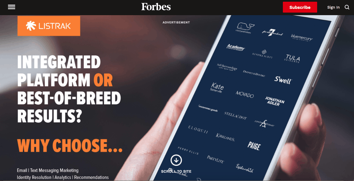
The example below of from Forbes. Upon entering the site we are greeted with this massive full page ad. It is unsightly and all around terrible. But they are Forbes. They can get away with something like this. That doesn’t mean they should do it, but they have the audience and authority to do it.
Chances are, your site does not have the audience that Forbes does. You can’t get away with something like this. It will scare your audience away.
Make it relevant
Popups allow you to target your audience based on the content they are viewing. Making an irrelevent offer is a missed opportunity.
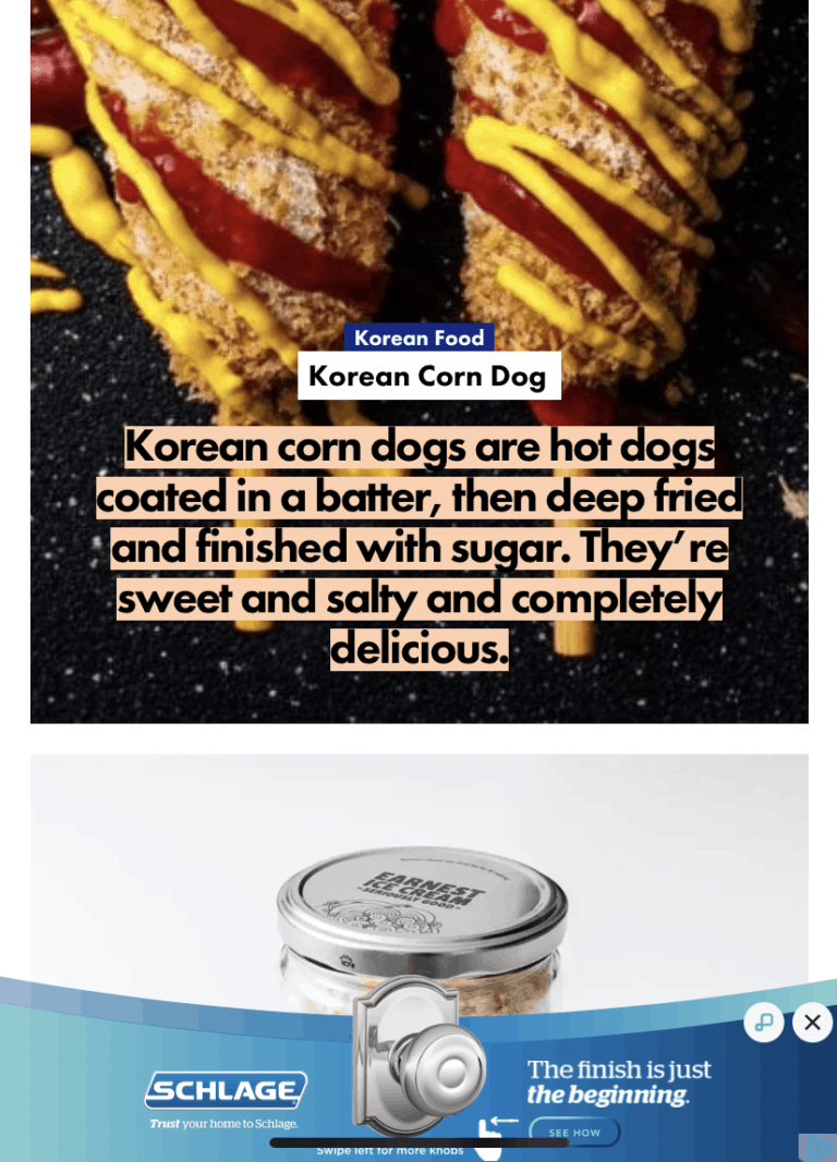
This popup is for a door lock. On a recipe site.
Don’t try to give them an offer they aren’t interested in. Make it as specific to the content as possible. Use them to grow your own business.
Don’t hide the exit
When you hide the exit people either sign up or leave the page. If they exit, they won’t return. It’s a terrible tactic. Get people to sign up because you’re offering so much value they can’t believe how lucky they are. Don’t try to force them in my leaving them no other options. Those people will not be loyal customers and will do nothing to grow your business.
Common mistakes
Spammy
“Click here to claim your new iPad” is one of the most cringy popups in existence. People see that and they instantly think they are getting a virus. In a lot of cases that’s probably true. Don’t do it.
Bad offers
There are several types of bad offers. The two most common ones are 1) An offer that isn’t relevant and 2) An offer that has no value.
We’ve already discussed why you need to have a relevant offer, but making sure it has value is equally important. Free junk is still just junk. People don’t usually give up their personal information for nothing. They want something in return. If they don’t feel your offer is worth their e-mail address, they won’t do it.
Bad copy
Copy is the words in your popup. Take a minute to think about your message. Don’t tell people why your product of offer is the best. They don’t care. Tell them what you can do for them.
Poor design
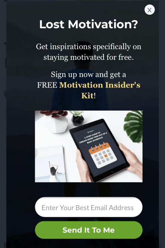
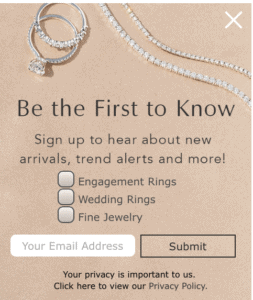
Some popups are just ugly. If you have something painful to look at, people won’t be interested in what you have to offer. It’s as simple as that. Make the popup appealing.
This ad if for jewelry, but the background makes me feel like its printed on a cardboard box. Nobody wants to buy an engagement ring from a cardboard box.
This ad should be elegent. It should invoke an emotional response. It should let you know THIS is the company that will deliver the perfect ring. Instead, it reminds me I have a barkbox coming in the mail today.
Tools
Lorem ipsum dolor sit amet, consectetur adipiscing elit. Ut elit tellus, luctus nec ullamcorper mattis, pulvinar dapibus leo.

Lorem ipsum dolor sit amet, consectetur adipiscing elit. Ut elit tellus, luctus nec ullamcorper mattis, pulvinar dapibus leo.
Examples of Bad Pop-Ups
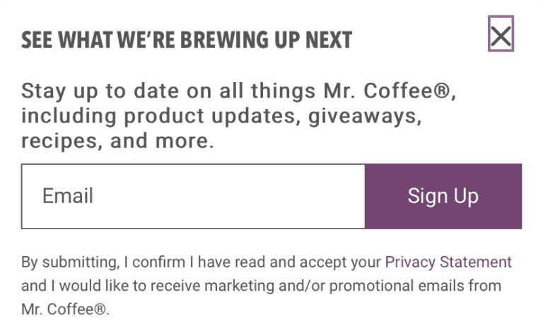
This pop-up was found on the Mr. Coffee website. While I am intrigued by what recipes I my $20 coffee maker could create, I am not trading that for my e-mail address.
If you are giving your email address for that new Mr. Coffee pumpkin spice latte recipe, you have an addiction and need to seek help immediately.
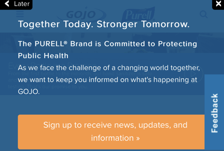
This is another pop-up that’s on the same page as the one offered by Mr. Coffee. I can’t think of any circumstance where I would be interested in getting e-mail updates from a hand sanitizer company.
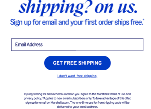
We have already discussed bad copy and this is another painful example. The offer is great – Free Shipping – but they way it reads is terrible. Bad copy kills ads.
Examples of Good Pop-ups
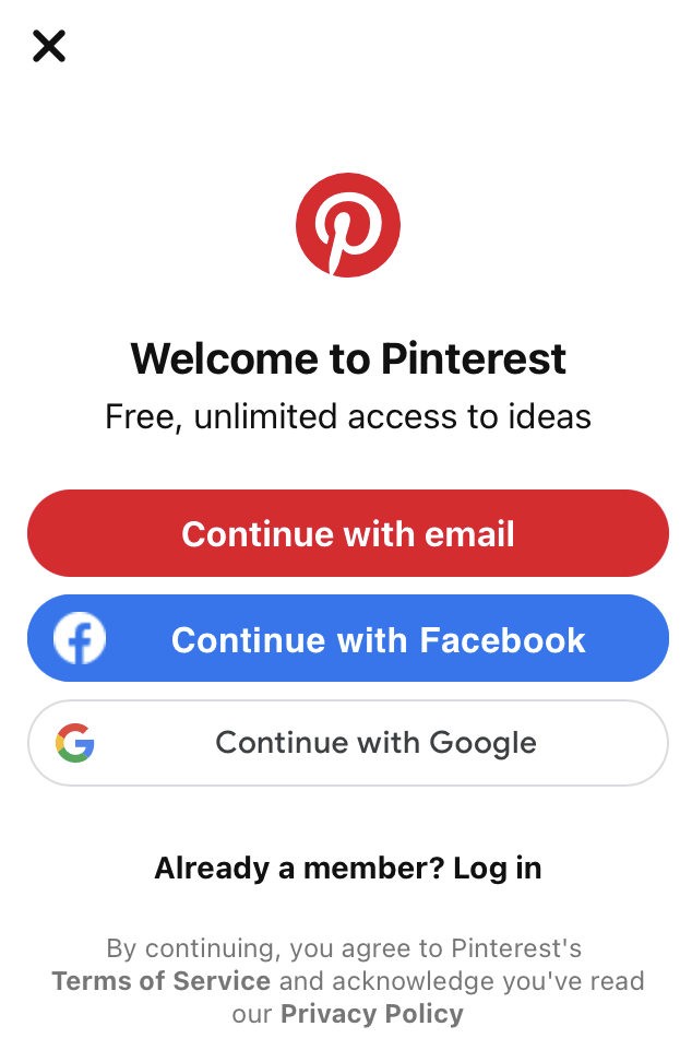
This Pinterest pop-up is designed to encourage people to sign up.
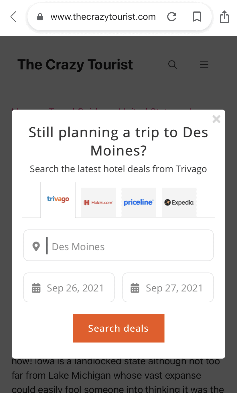
Normally I would advise against directing people to other sites in your pop-ups. But it works here.
The crazy tourist is a travel blog. I was looking up information about Des Moines and as I was about to exit, this showed up.
This works because I was looking for things to do in Des Moines. My search showed there was an interest in traveling to this specific location. Delivering a way to do that is genius.
This pop-up will end up providing the site some good affiliate income. We,ve all seen paid ads show up on sites, but they are rarely as targeted and effective as this one.
Lorem ipsum dolor sit amet, consectetur adipiscing elit. Ut elit tellus, luctus nec ullamcorper mattis, pulvinar dapibus leo.

Like I said, if you aren’t using pop-ups, you should be.

